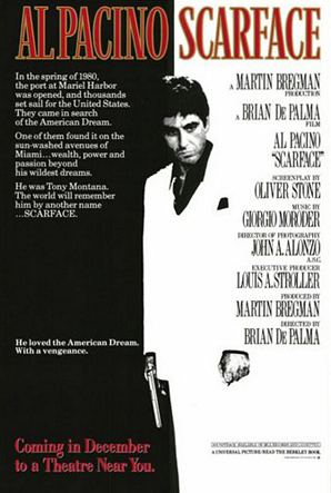
The Brian de Palma film,Scarface,was made famous by its iconic poster, which has become a must have accessory for any teenage boy wishing to spice up their bedroom. This iconic film poster has not aged with time and still holds codes and conventions of modern day film posters.
The most stand out feature of the poster is the black and white/negative effect. It stands out to the audience and is an unusual tool for drawing attention, yet it still works. The negative effect is also used on the actor in the poster, reversing the colours of his suit and making him stand out from the rest of the poster.
It also uses the 80's colour scheme for interior fashion, Red,Black and Chrome. This adds to its class,making it trendy and interpretable to the feel of the era. This has made it so iconic and popular due to its symbol as a trend setter. We will have to find a symbol of our era to perhaps include in our poster.
It has a brief subtext to try and explain the film before you see it, giving the audience a taster before the film is released to encourage a large audience. It informs to the minimum to make people want to know to the maximum. The credits are large to give of the prestige of the production, showing those involved in the filming. We will add the credits to subtly, not to defer people from the lack of repute.
.
Harry Mountier and James Banister

No comments:
Post a Comment